画像
Materialize を使用すると、さまざまな方法で画像にスタイルを適用できます
レスポンシブ画像
画像をページの幅に合わせてレスポンシブにサイズ変更するには、クラス responsive-img を画像タグに追加します。これで max-width: 100% と height:auto が適用されます。
<img class="responsive-img" src="cool_pic.jpg">
円形の画像
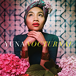
これは正方形の画像です。円形にするには、「circle」クラスを追加します。
画像を円形にするには、 class="circle" を追加します
      <div class="col s12 m8 offset-m2 l6 offset-l3">
        <div class="card-panel grey lighten-5 z-depth-1">
          <div class="row valign-wrapper">
            <div class="col s2">
              <img src="images/yuna.jpg" alt="" class="circle responsive-img"> <!-- notice the "circle" class -->
            </div>
            <div class="col s10">
              <span class="black-text">
                This is a square image. Add the "circle" class to it to make it appear circular.
              </span>
            </div>
          </div>
        </div>
      </div>
動画
埋め込み動画をレスポンシブにサイズ変更するコンテナを提供しています。
レスポンシブ埋め込み
埋め込みをレスポンシブにするには、クラス video-container を持つ div でラップするだけです
      <div class="video-container">
        <iframe width="853" height="480" src="//www.youtube.com/embed/Q8TXgCzxEnw?rel=0" frameborder="0" allowfullscreen></iframe>
      </div>
レスポンシブ動画
HTML5 動画をレスポンシブにするには、クラス responsive-video を動画タグに追加します。
  <video class="responsive-video" controls>
    <source src="movie.mp4" type="video/mp4">
  </video>